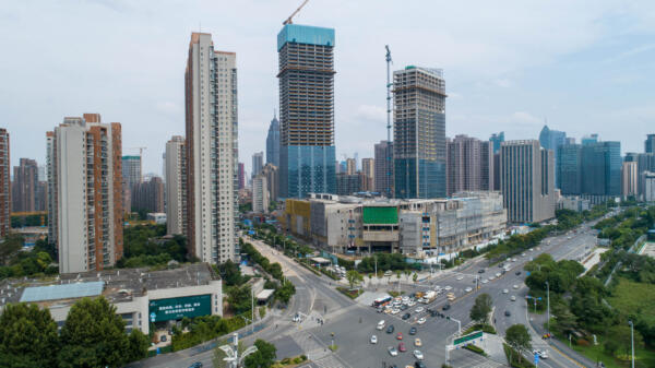
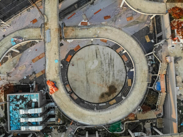
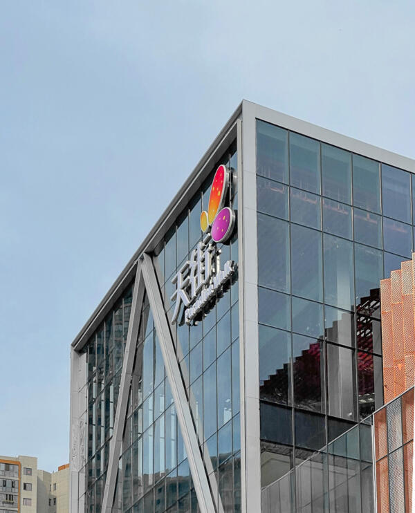
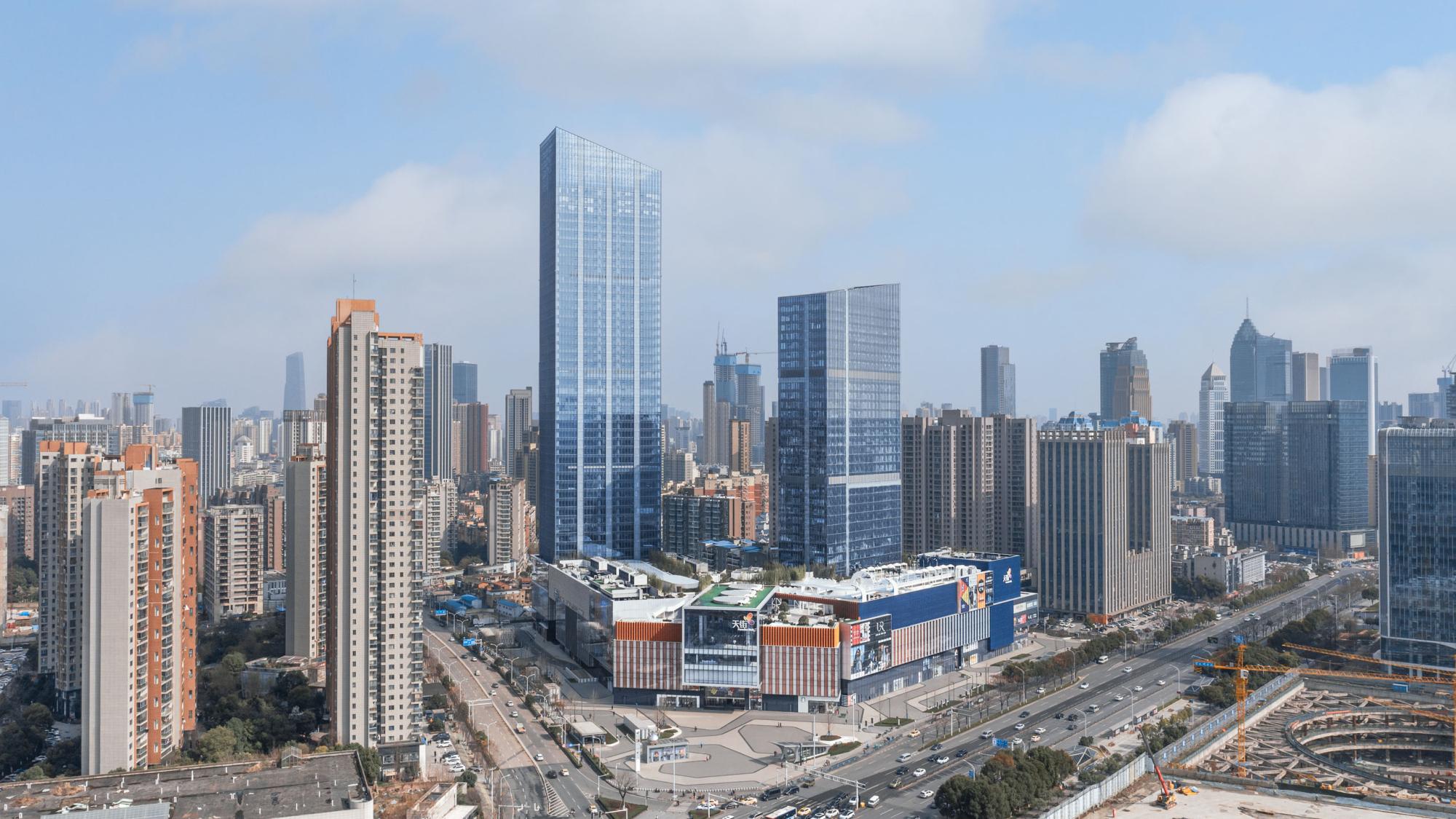
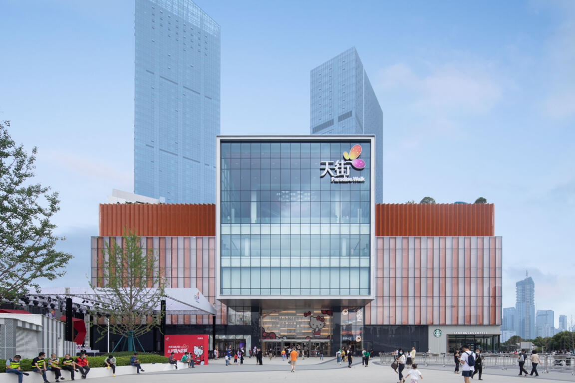
As one of central China’s flagship malls, Paradise Walk Wuhan Jiangchen sets new standards for large scale urban retail in conjunction with mixed-use and TOD.
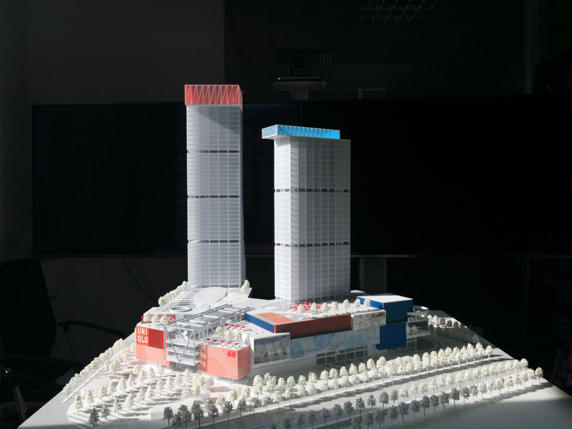
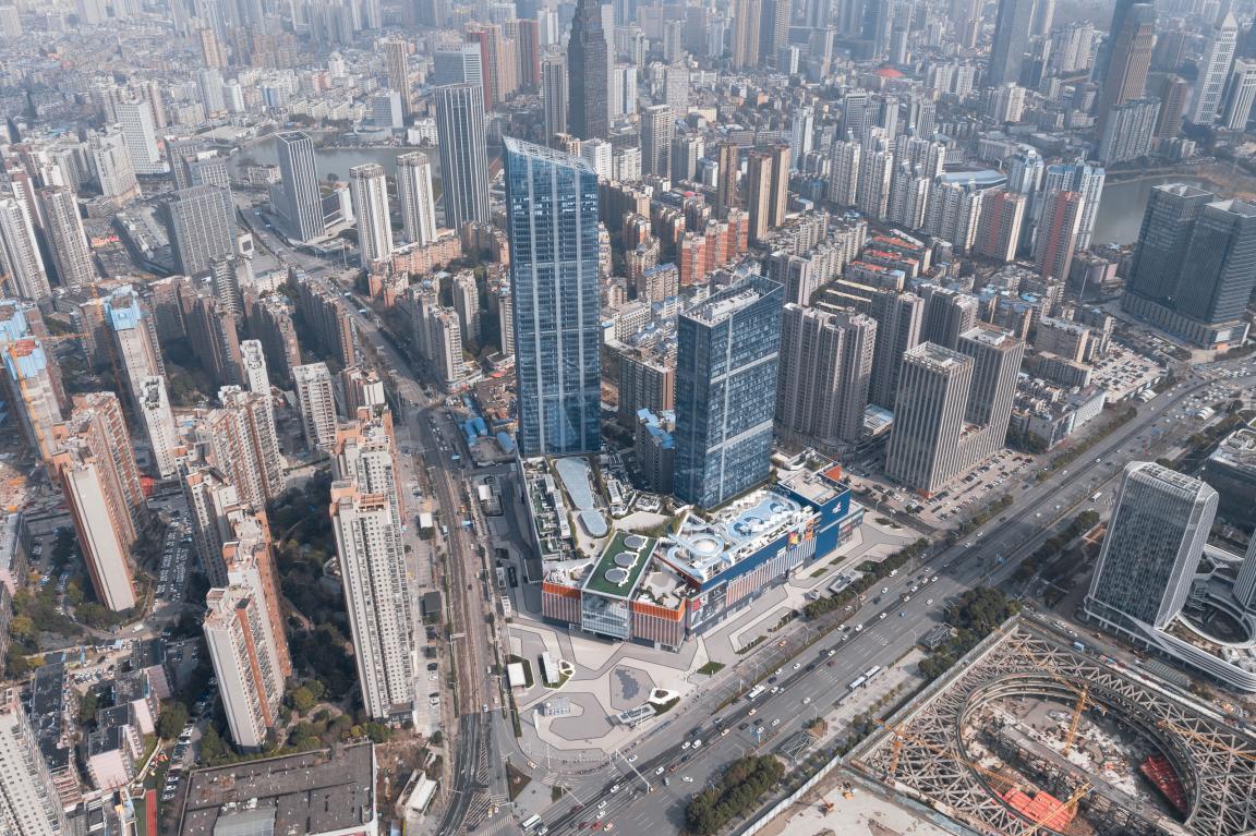
370,000 sqm of Paradise Walk
This transit base induces a dichotomy in the functional setup of the retail floors: its hub character strives to swiftly accept, channel, and distribute large passenger volumes vertically into the business zones, while the retail aims at attracting and retaining visitors to dispense them horizontally into its multiform commercial environment.
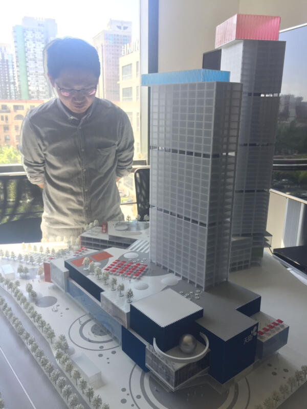
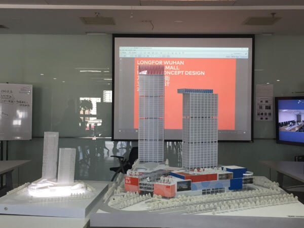
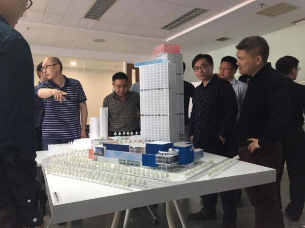
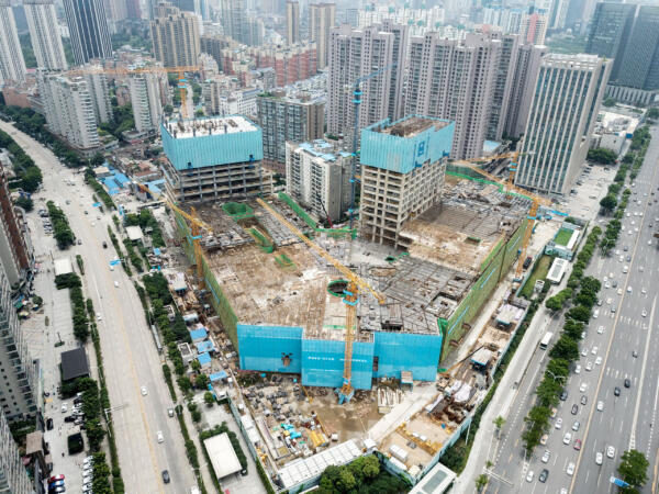
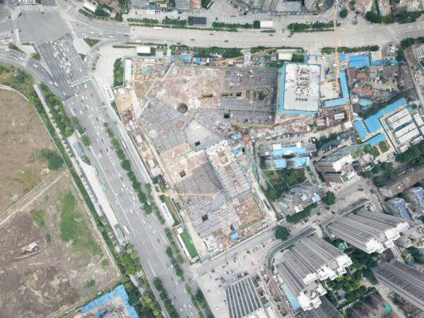
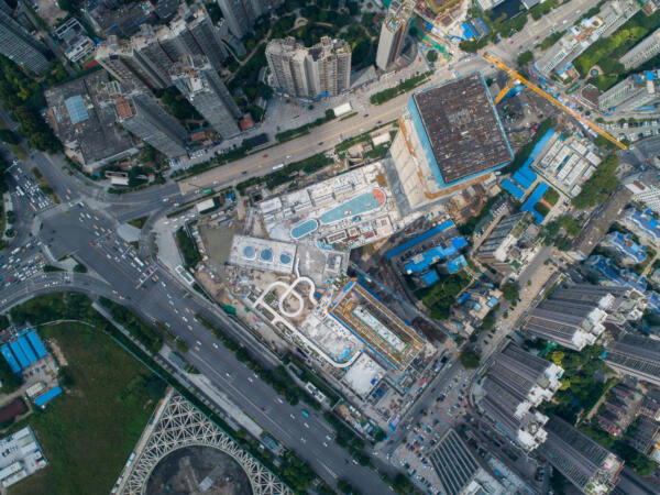
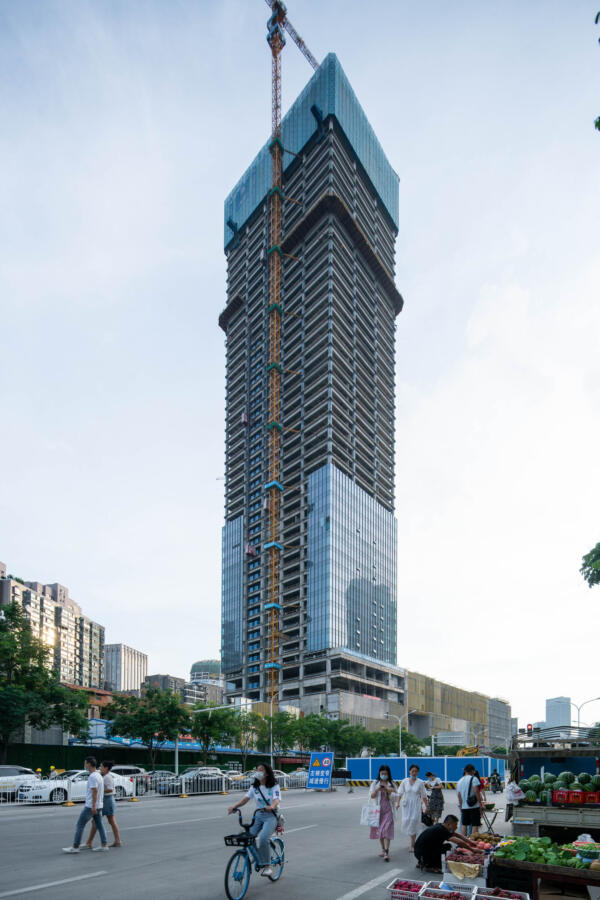
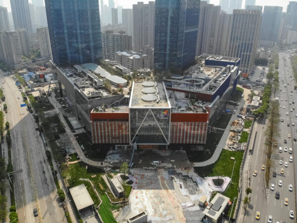
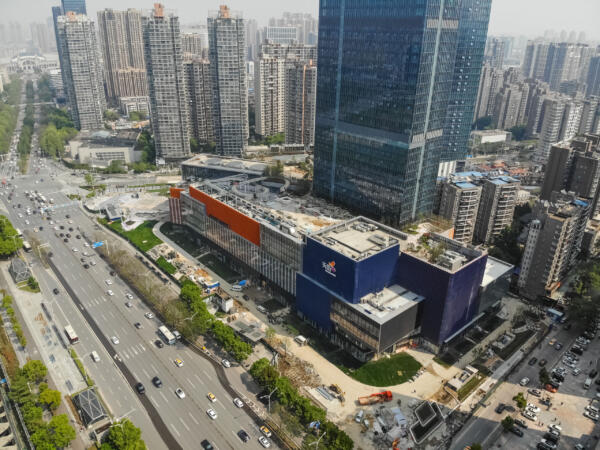
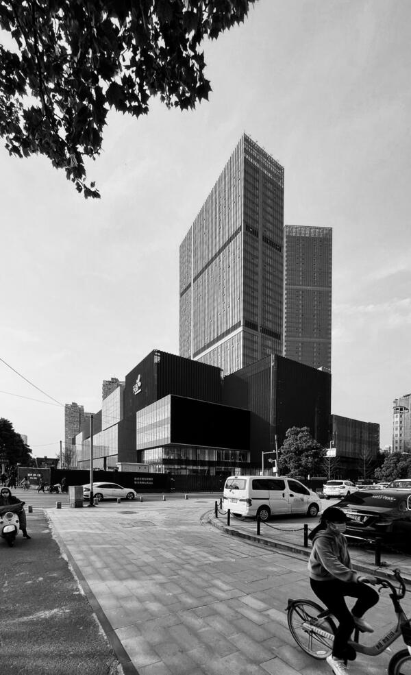
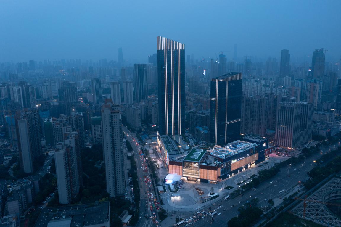
On a triangular plot topped by two office towers, the 110,000 sqm mall’s two wings converge towards the apex of the site, informing the placement of key spaces, their hierarchical order, and their distinct shape.
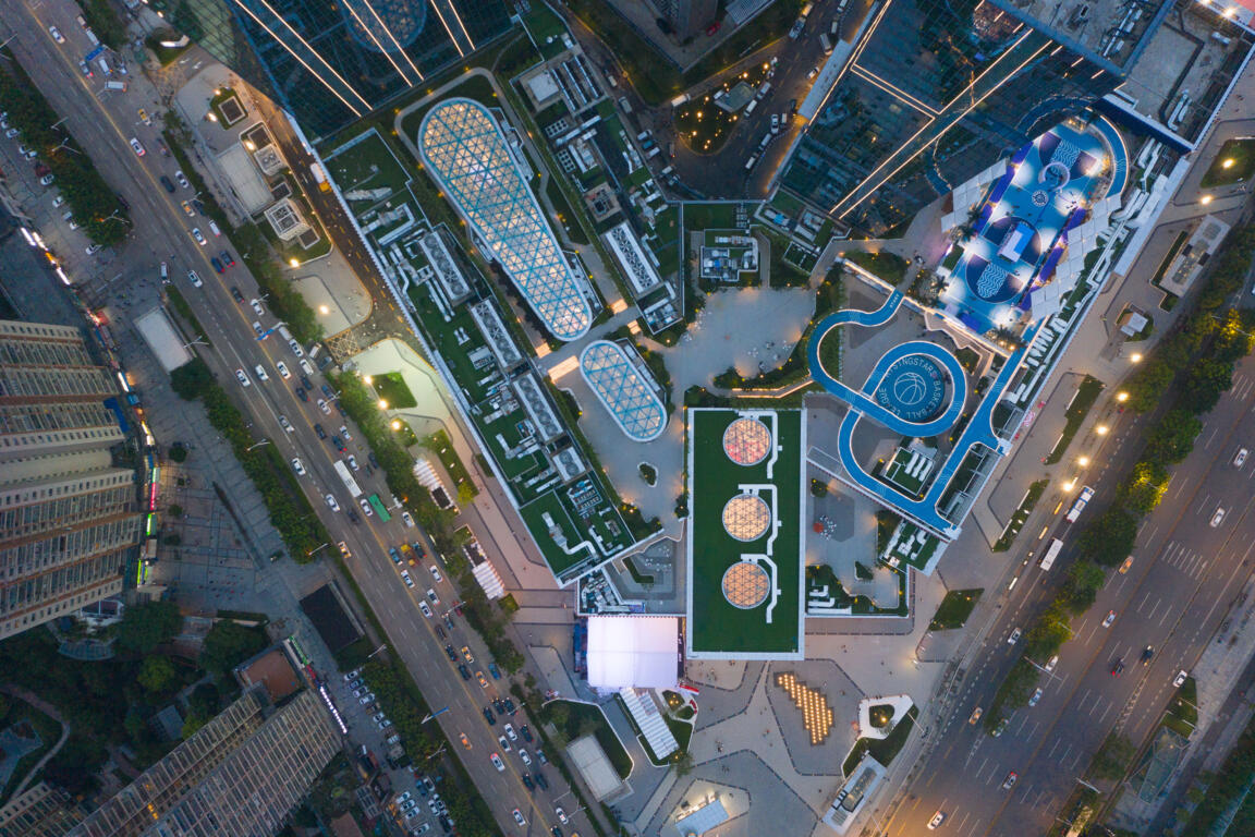
The bridge, the source & the gorge
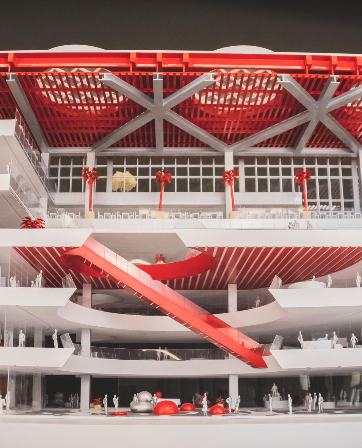
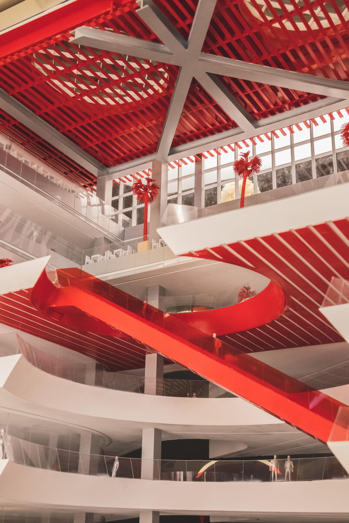
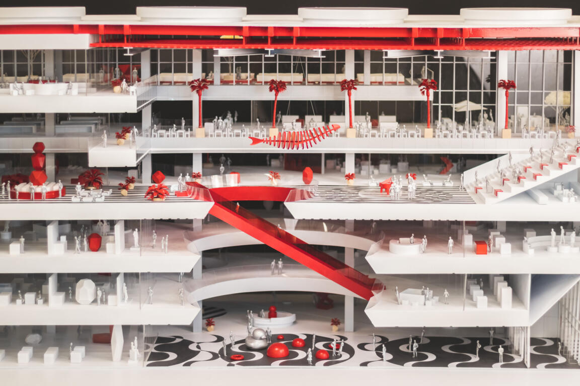
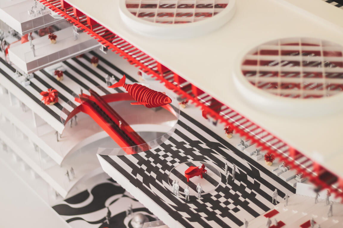
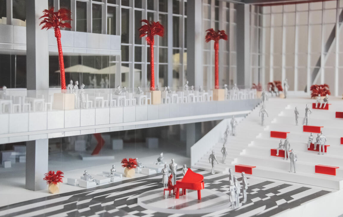
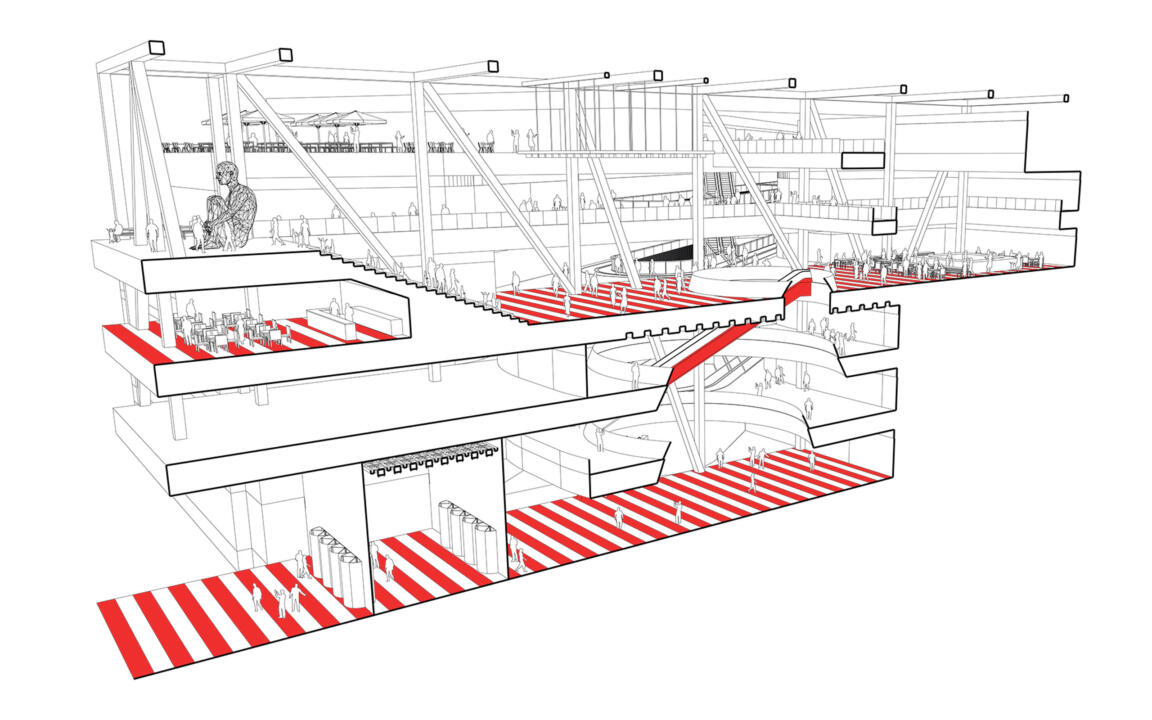
Reflecting Wuhan’s strong river bond, three key interior zones take up water themes, articulating them in spatial layout and material choice, to consequently evoke an emotional reaction in visitors.
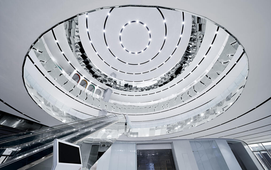
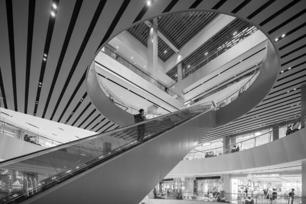
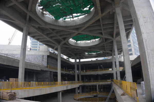
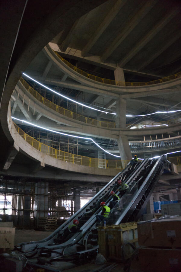
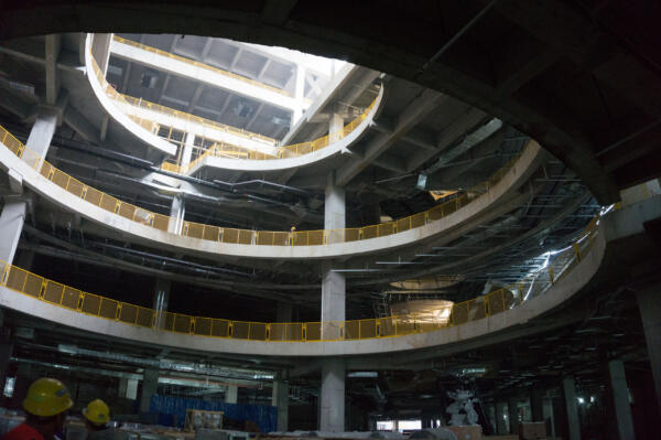
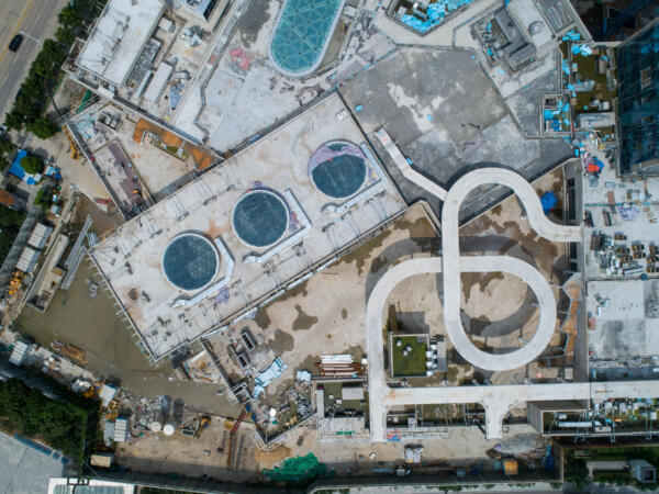
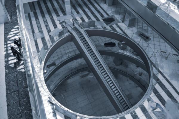
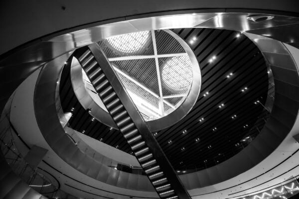
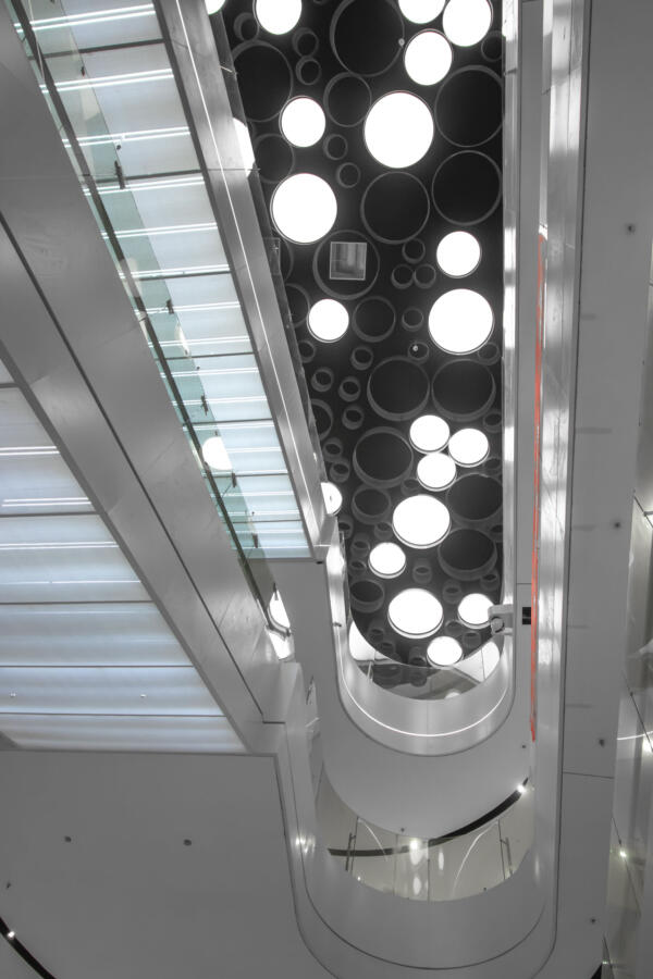
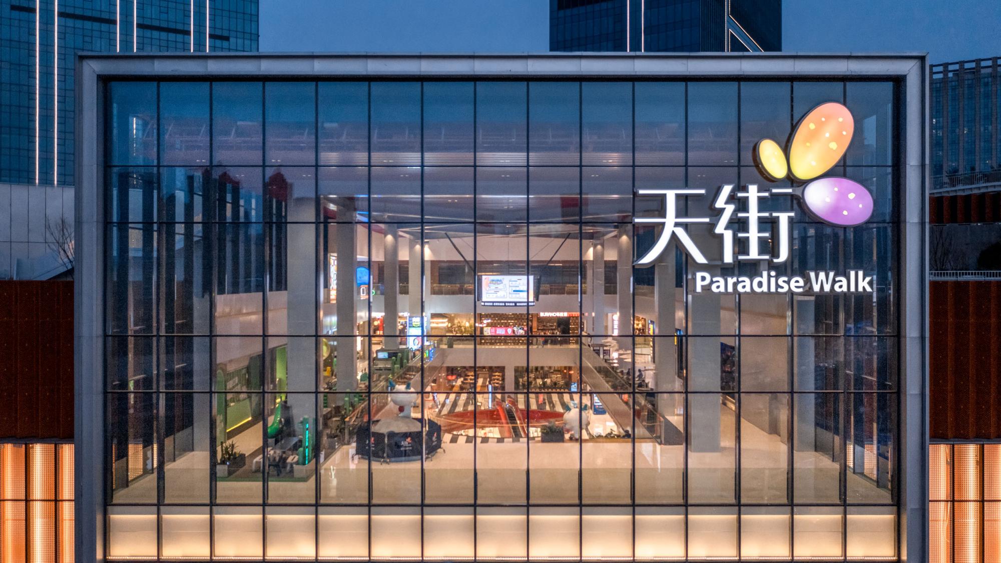
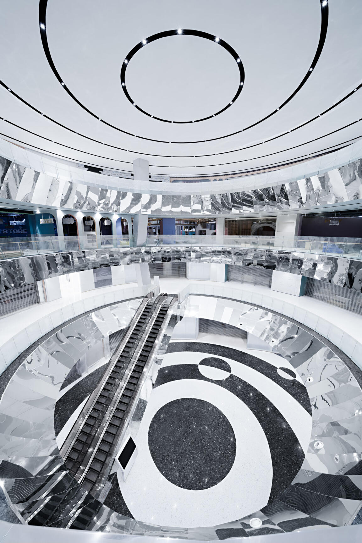
The Source stands as the origin of water as it emerges from the ground. The spherical multi-story atrium symbolizes concentrated power in concentric monochrome patterns that energetically direct movement. The dense ceiling orbits are mirrored in the black-and-white circles of the floor to anchor the space at its base. Mirror accents in the vertical circulation create bright visual effects, with escalators appearing to cascade as they transport people from one level to another. Connecting to the metro hub, the Source is the discharge point of allocation into the development.
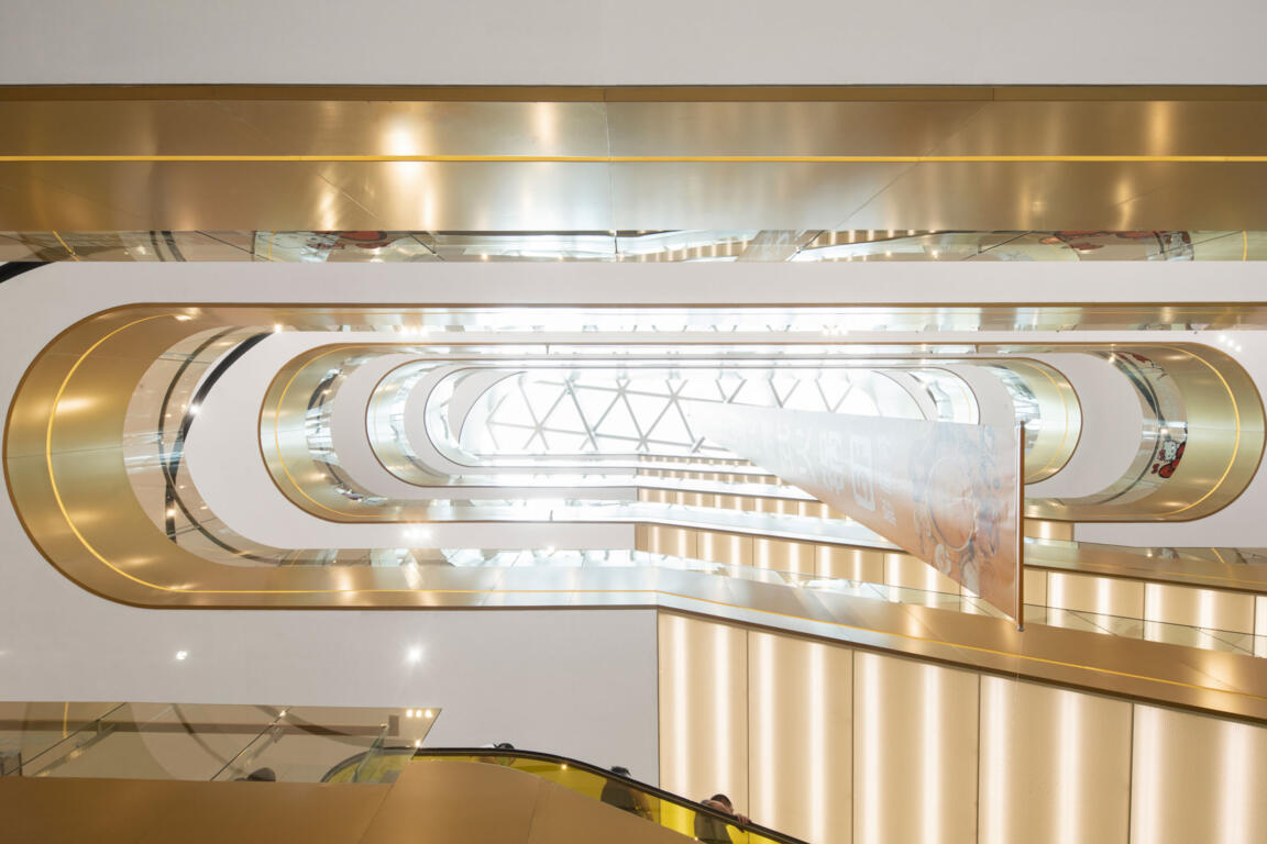
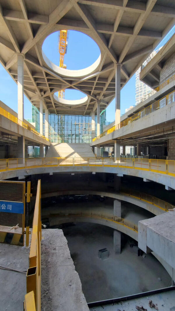
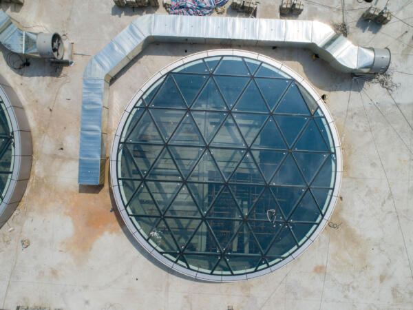
In the opposite wing, the Gorge creates a very different atmosphere: like a deep ravine, a narrow, elongated atrium extends across several stories, offering select skyward views. Levels differ in strata-like banding to provide distinct spatial experience with every turn, in an ascending move towards the large skylight. Narrow wood-clad bridges crisscross the void, introducing a natural character that is taken up by the warm tones of the vertical surfaces.
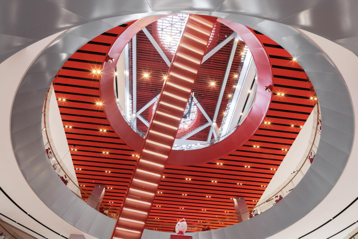
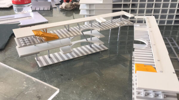
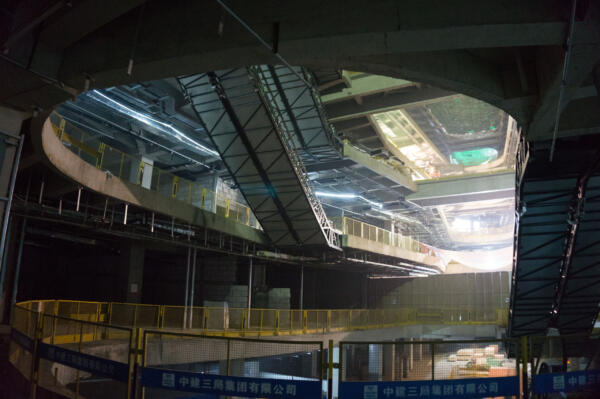
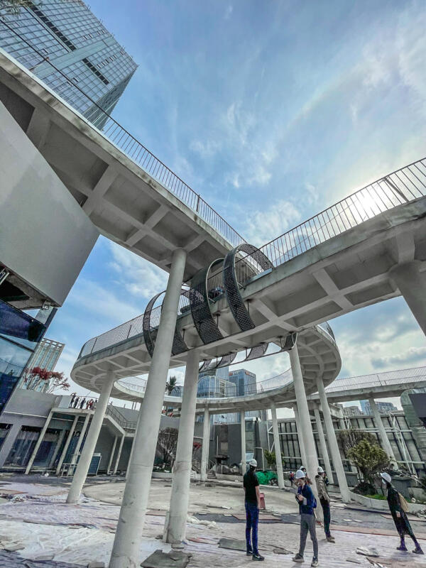
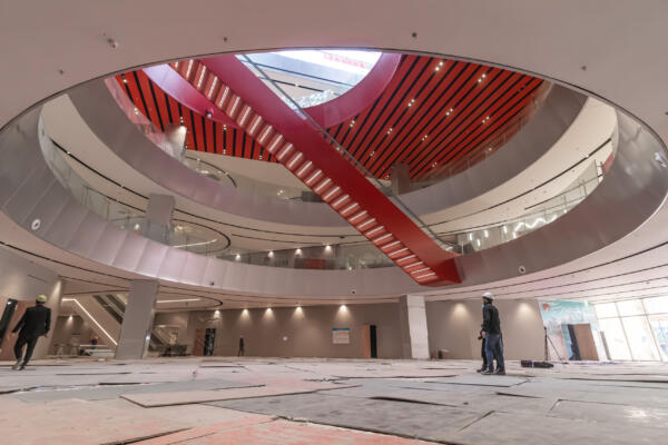
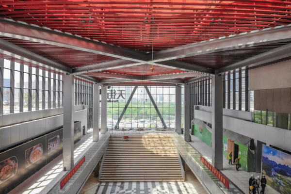
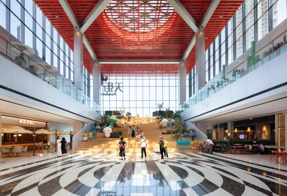
The Bridge, the connecting element between the two wings, acts as a spatial and metaphorical hinge: a central zone for encounter and celebration, a communal gathering point, and a vertical and horizontal distributor. Red feature escalators cross a cylindrical void on multiple levels, moving visitors vertically through this pivot point.
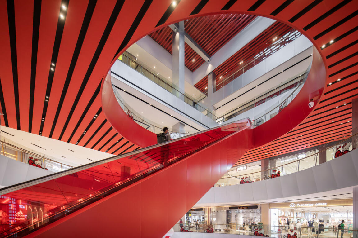
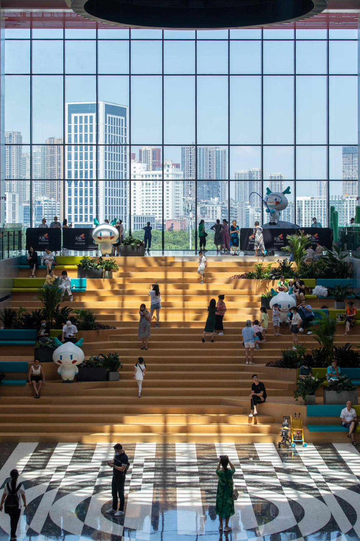
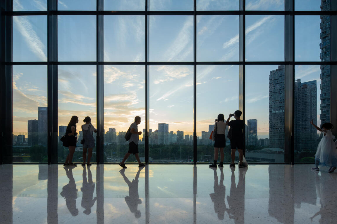
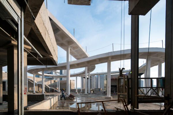
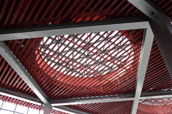
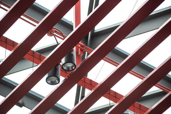
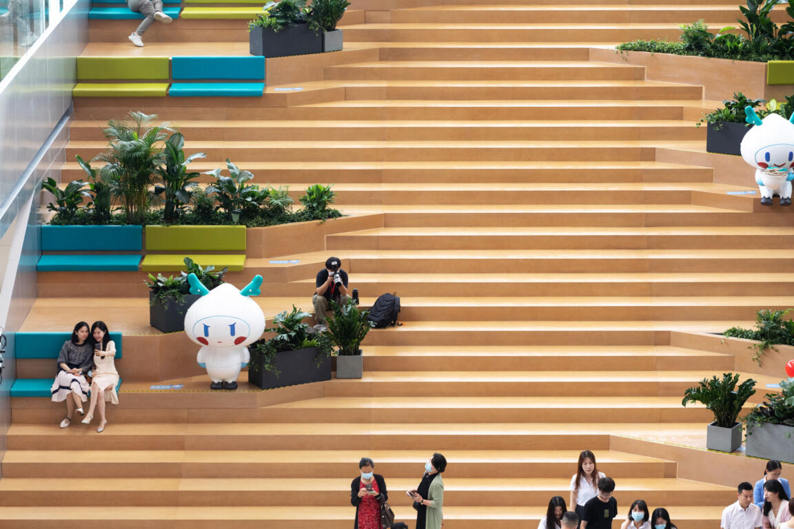
From here, a linear event space stretches out to culminate in a full-width landscaped stair that leads up to a panoramic window: an elongated cantilever that prominently reaches out into the surrounding cityscape. The bridge narrative continues in the industrial feel of the bright red exposed ceiling structure.
Identity Colours
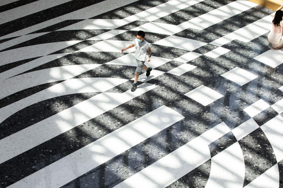
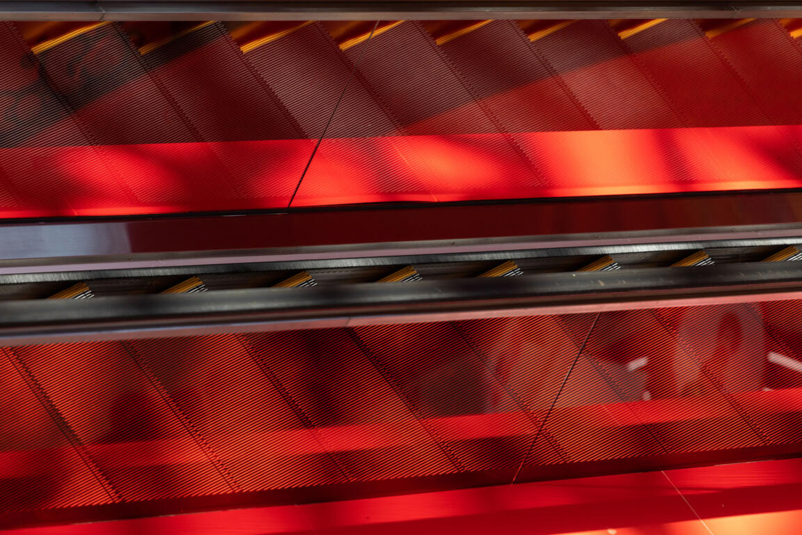
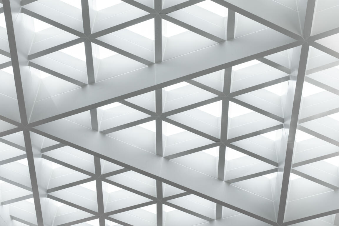
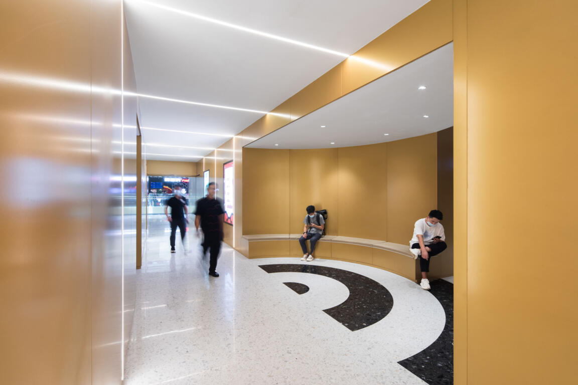
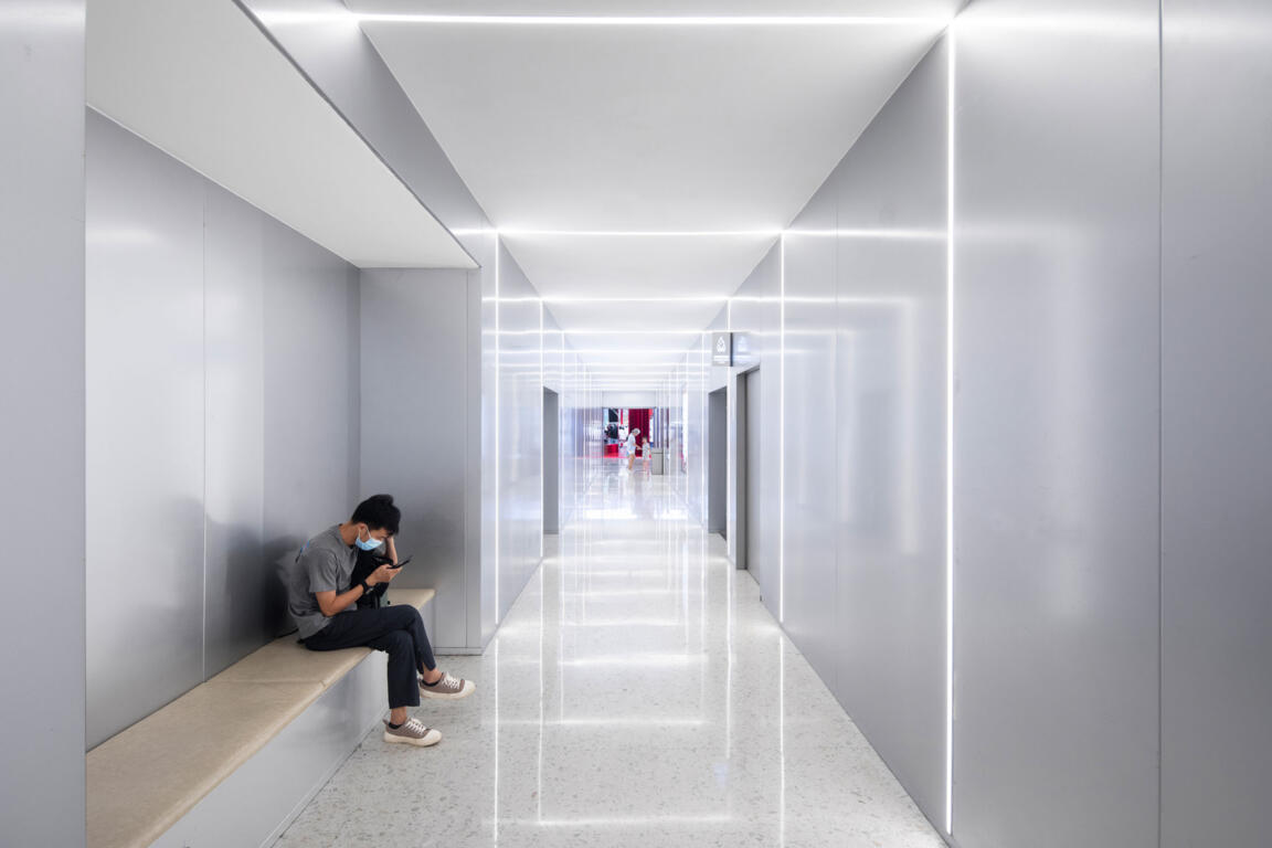
Throughout the mall, strong colour accents mark spatial importance and activity. Diverse floor and ceiling patterns emphasize different ways of movement: waves and linear stripes create directional dynamics, while circles establish focal points. Clustered circles evoke ‘bubbling’ aesthetics that highlight feature zones. Ancillary and transitional spaces take up the bold patterns together with softer colours and warm textures.
Colour-changing Facade
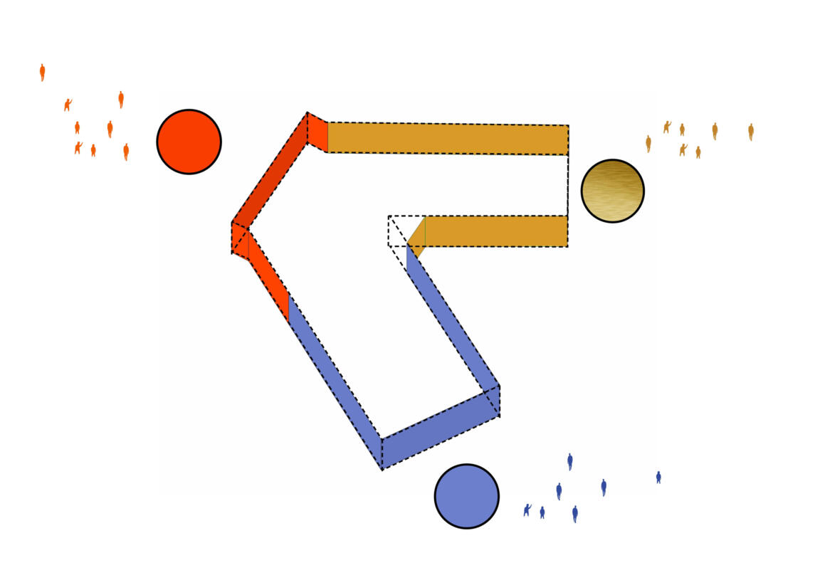
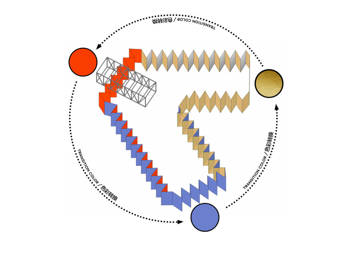
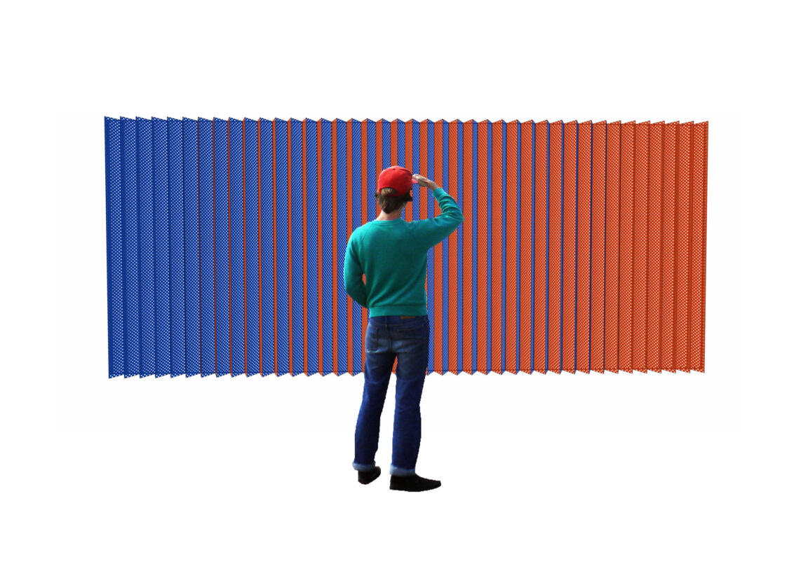
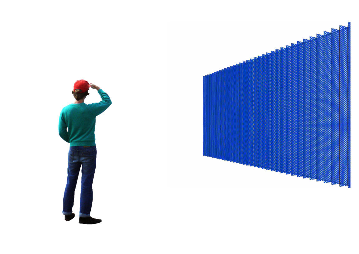
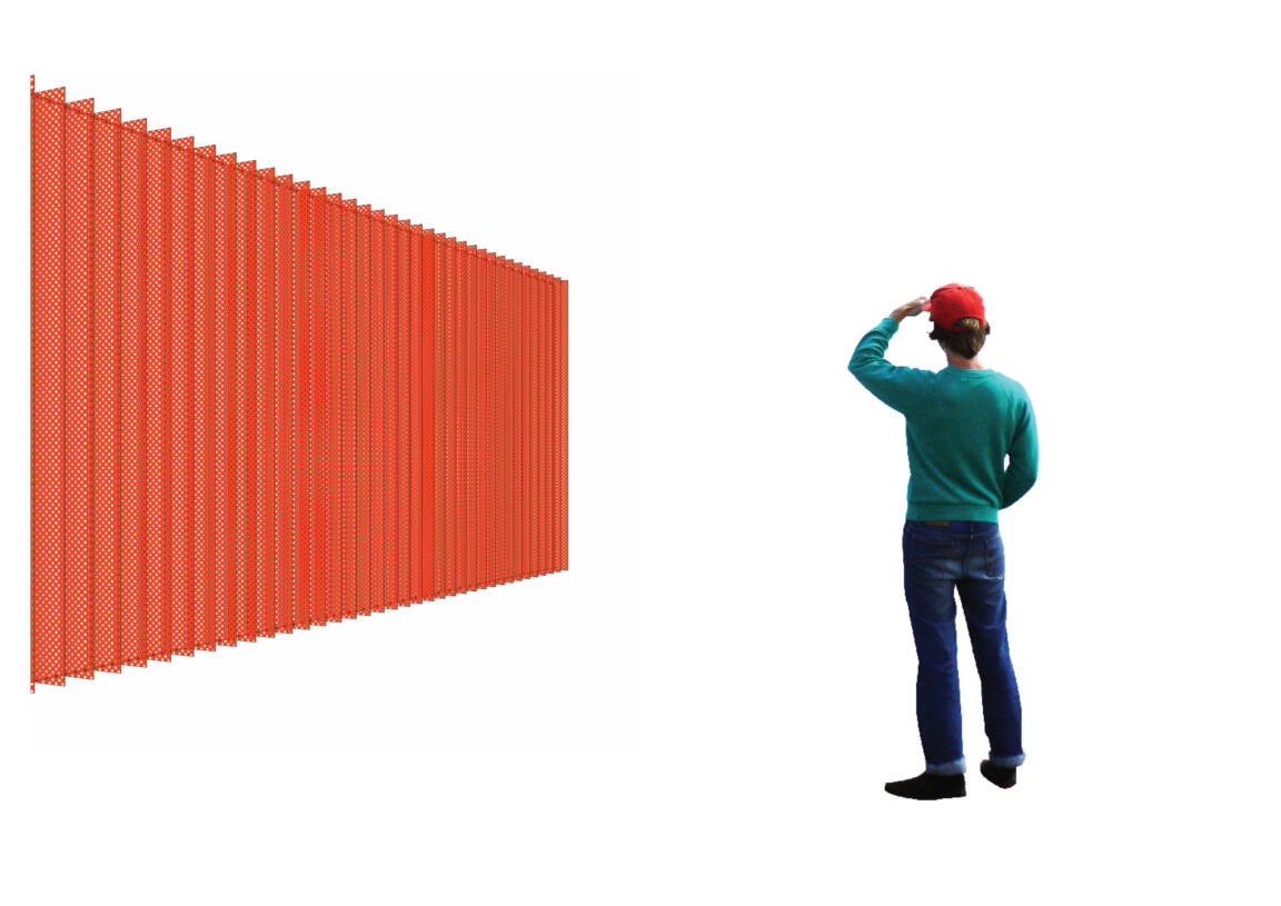
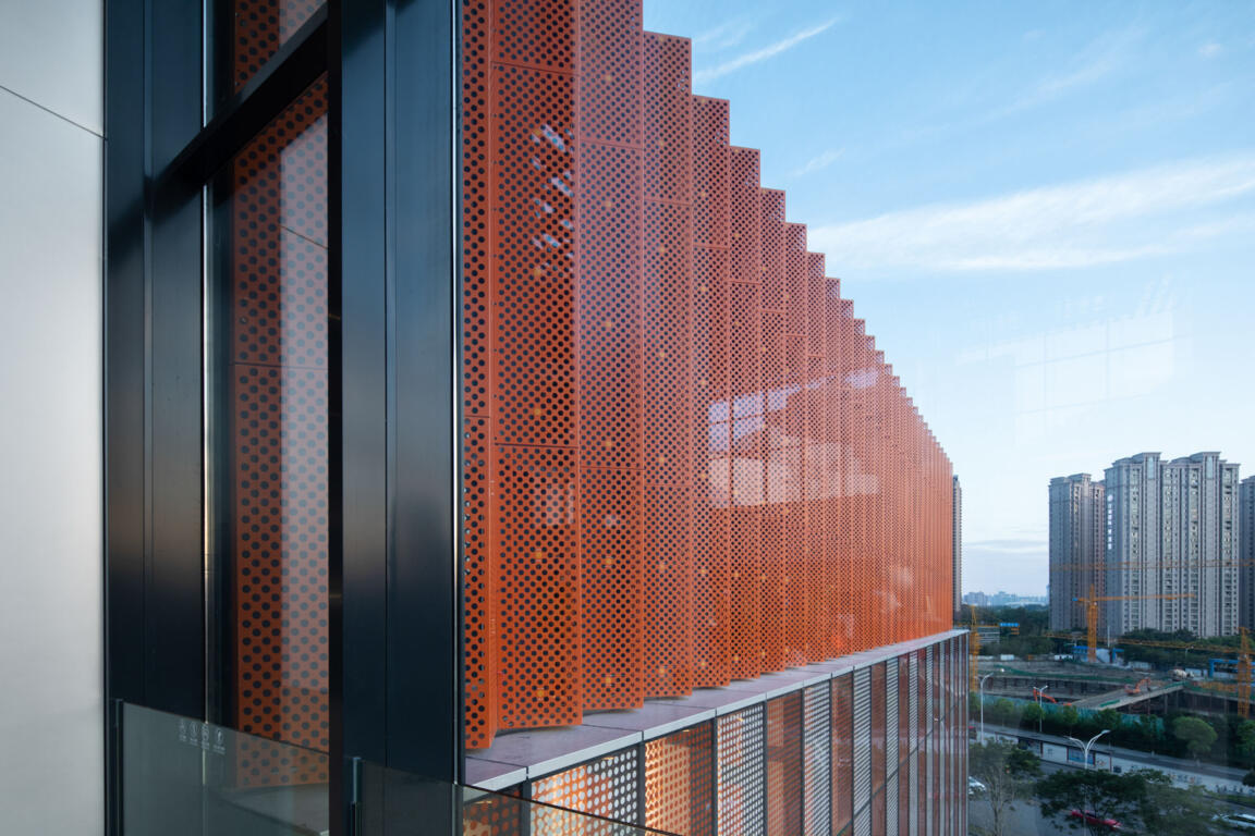
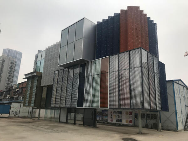
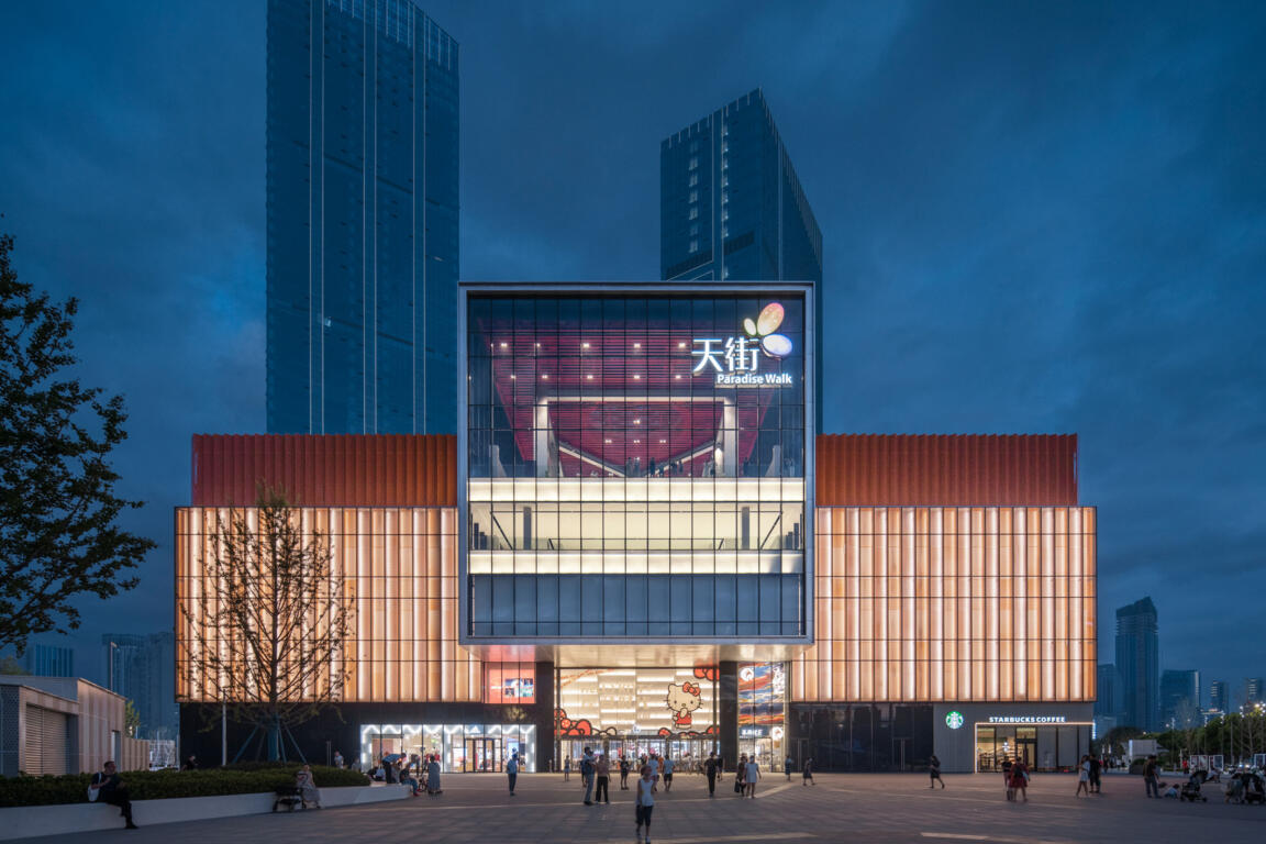
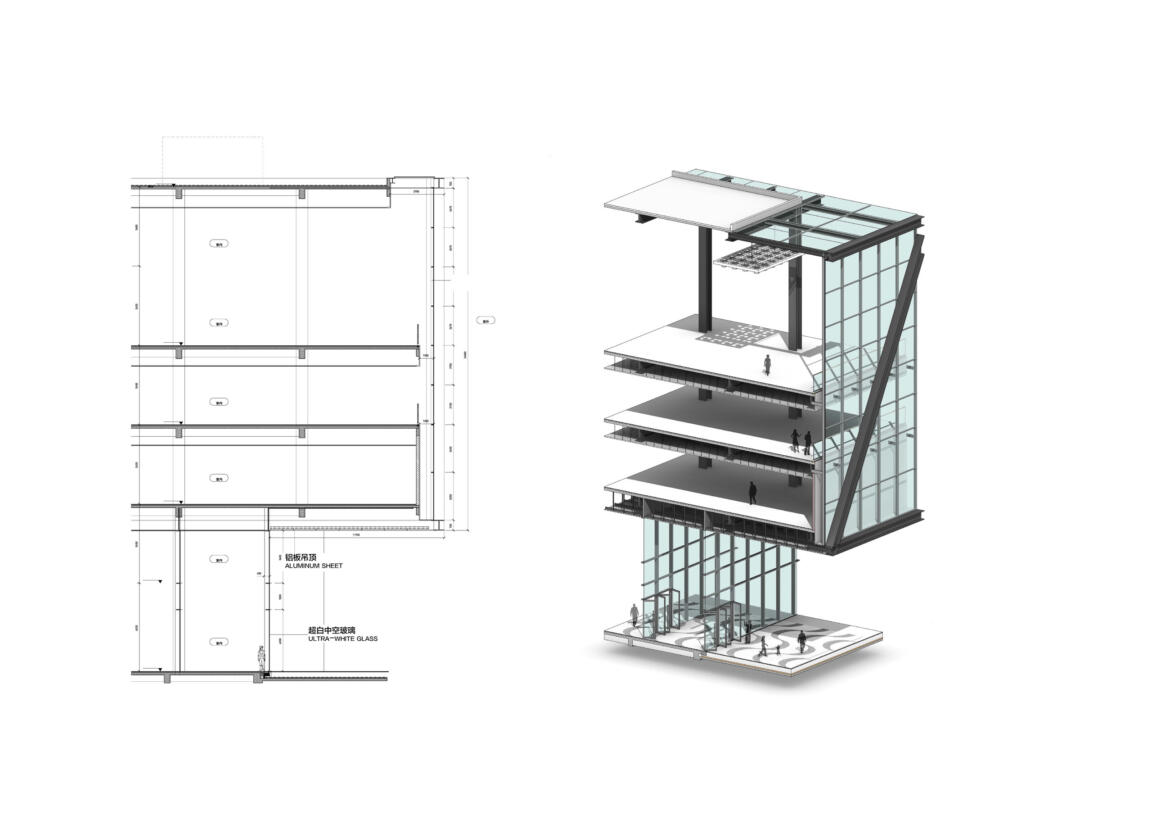
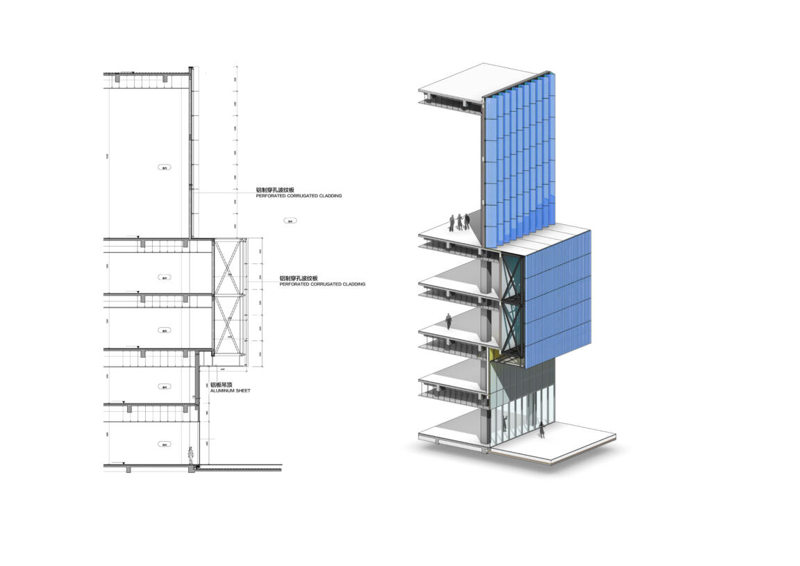
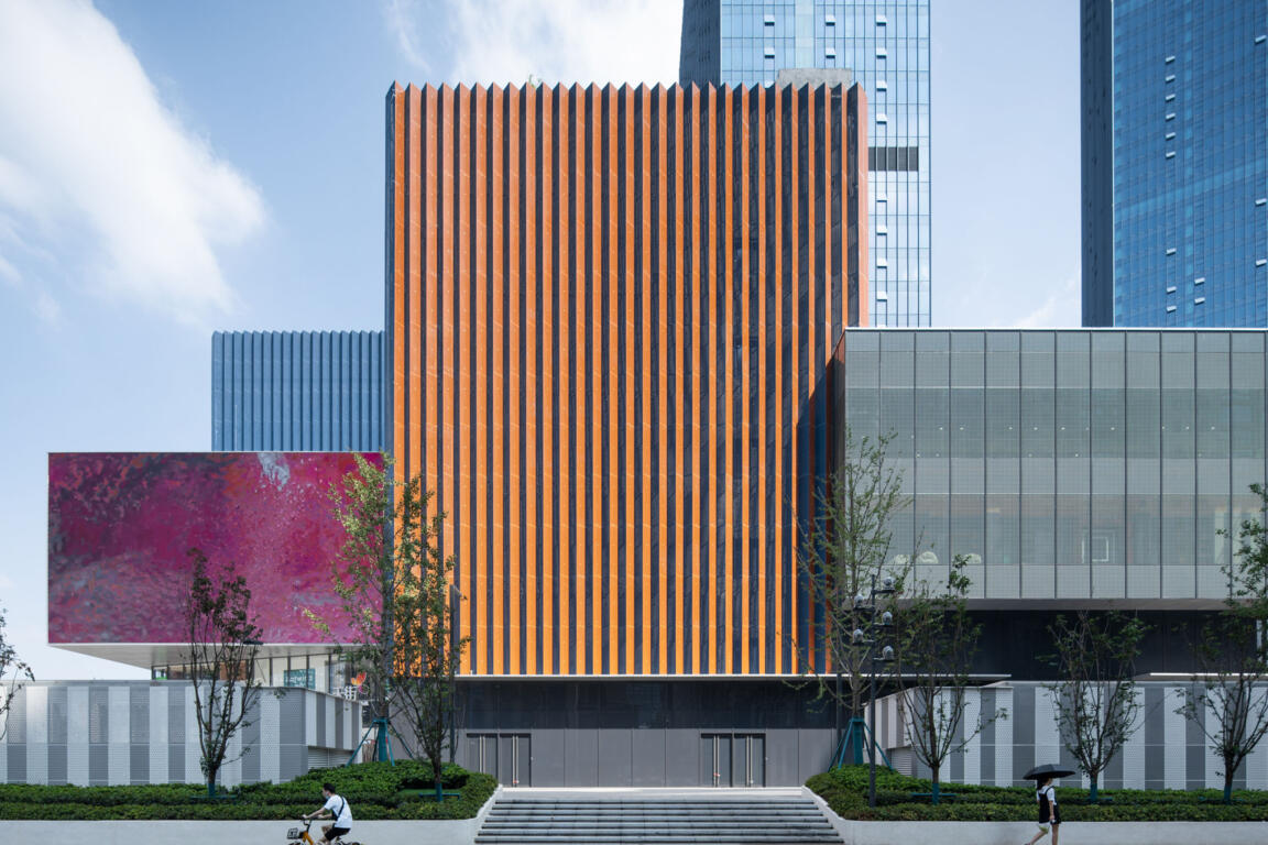
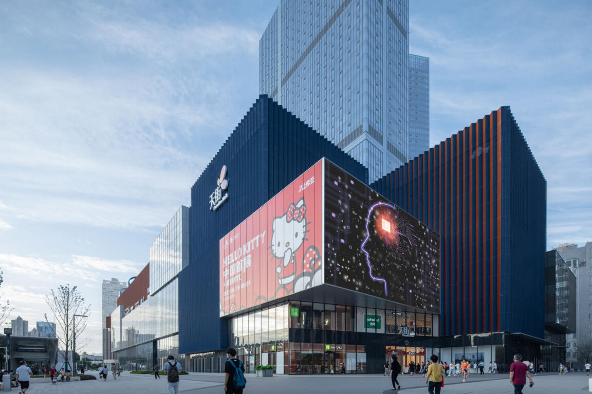
The interior key zones and their dynamics are reproduced in the approach toward the exterior façade design: the corners set out the colour identities of their respective adjacent facades, with each side of the triangular footprint represented in an individual colour scheme of gold, red, and blue. The strong hues diffuse in a dynamically pleated façade that adds three-dimensional depth and a clever two-fold colour play, allowing for different aspects from every view angle. Perforated metal screens feature diverse intensities of corrugation for further articulation and visual layering along the extended sides. This introduces lightness and differentiation to the stacked volumetrics, effectively breaking down building mass.
This multitude of spatial experiences helps create an environment that encourages visitors to return and explore time after time.
